.png)
Observing service performance
Analyzing service status in real-time
To analyze the status of a service in real-time for the last 60 minutes and the last 24 hours, open the Service View in the Finder:
Go to the Services section in the accordion of the Finder.
Double-click the name of the service.
An overview of the service is displayed in a new tab. The overview is divided into two differentiated parts:
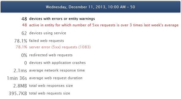
The upper half part, which shows the metrics that measure the performance of the service:
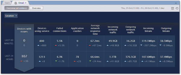
In turn, the metrics that measure the performance of the service are divided into two rows. The first row gives a short-term view of the service for the last 60 minutes and the second row gives a longer-term view for the last 24 hours. For each metric, you get the current value over the period of 60 minutes or 24 hours and the difference with respect to the previous period. For instance, if the time now is 16h40 (measured with a 10 minute resolution), the last 60 minutes span from 15h40 to 16h40 and the difference is computed with respect to the time span from 14h40 to 15h40.
An indicator arrow accompanies the difference value. The arrow points up if the current value is bigger than the previous value and it points down if the current value is smaller than the previous value. In addition, the color of the arrow indicates if the variation on the value of the metric means an improvement or a degradation of the service, because bigger does not necessarily mean better. For instance, an increasing number of failed connections is indeed a bad sign for a service. The arrow looks therefore green when the service improves, red when the service degrades and blue if the metric is merely informative and neutral with respect to the quality of the service.
The lower half part, which shows the evolution of the selected metric over time:
The evolution of service metrics is shown as a bar chart, which is in turn composed of two parts as well. By default, the top bar chart shows the total values of the metric during the last 24 hours and the charts below break down the total into the partial values according to your defined hierarchies.
Similarly to the indicator arrows that compare the current value of a metric to its previous value, the bar charts also use a color code for quick visual recognition. A red bar indicates an error condition in one or more of the concerned devices, yellow means warning and blue is used for neutral metrics. The metric Devices with issues may combine error and warning conditions in a same bar. The amount of red and yellow in the bar is then proportional to the number of devices with errors and warnings respectively. A single device may also have yellow and red combined on its own bars, meaning that the device generated both errors and warnings during the specified period.
Service overview in one or all Engines
When the Cross-Engine features are enabled in the Finder, the option Overview (all entities) at the top-left of the service view displays results for all Engines. Select the option Overview instead, to display results for the current Engine only.
Breaking down results by hierarchy levels
When the Overview (all entities) button is pressed, you can break down the results by the leves defined in your hierarchy in a similar way as you would do in the Portal:
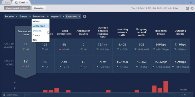
To focus on the results of a particular node in the hierarchy:
Select the desired node from the hierarchy navigation bar at the top-left corner of the service view.
Click the name of the node in the bar chart at the lower part of the service view. The bar chart displays the results of the nodes located one level below the node selected on the navigation bar.
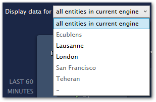
When the Cross-Engine features are disabled or you selected the Overview button, you are limited to navigate through the entities of the current Engine. To focus on the results of a particular entity:
Select the entity from the list placed at the top left corner of the tab window, preceded by the legend Display data for.
Click the name of the entity at the head of its corresponding bar chart.
When you focus on an entity, the top bar chart shows the values of the metric for that entity only. The bar charts below, when present, show the individual devices belonging to the entity and whether they contributed to the value of the metric or not during a particular hour. Therefore, the bar charts for individual devices are only present when the selected metric counts the number of impacted devices. In this case, bars do not denote a quantity level, but just membership of a particular device to the group of impacted devices. If the selected metric computes anything other than a number of devices, such as an average of connections or network traffic, there are no bar charts for the individual devices. Instead, you find the text no device data in this mode.
The metrics that count devices and, consequently, show individual device data are the same for both connection-based and web-based services:
Devices with issues.
Devices using service.
Application crashes (this metric does not count the number of crashes but the number of devices with application crashes).
Looking for an entity or device
Look for a particular entity or device in the bar chart by typing its name.
To look for a particular entity or device:
Find the text box with the magnifying glass placed to the left of the bar chart, on top of the names of the entities or devices.

Type in a part of the name of the entity or the device that you wish to find.
The bar chart displays only the entities or devices containing the exact sequence of characters typed in.
To the right of to the text box, there are a couple of arrows that are very similar to the arrows in the totals column. You can click the up arrow to arrange the displayed entries in alphabetical order or the down arrow to display the entries in reverse alphabetical order.
Evolution of service metrics over time
Right after you create a service, all its metrics have a zero value and the two rows that display the metrics (the first for short-term metrics and the second for long-term metrics) are both labeled Last 10 minutes. This is a consequence of the minimum time resolution of service monitoring. Both rows evolve incrementally every 10 minutes until they reach their maximum window of Last 60 minutes for the first row and Last 24 hours for the second row.
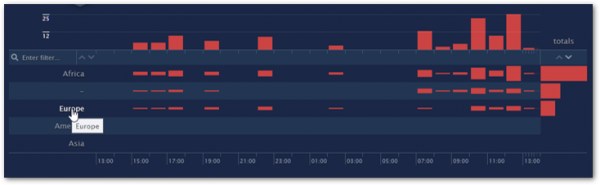
In the lower half part of the service overview, below the figures of the metrics, you find a bar chart that shows the evolution of the service with time. The bar chart graphically displays the values of the selected metric, as measured in intervals of one hour for the last 24 hours. To change the selected metric, click the name or the value of the metric that you wish to display. A pointer arrow zooms in the selected metric and singles it out from all the other metrics.
In the bar chart, the rightmost interval corresponds to the current hour. The interval of the current hour is divided into sub-intervals of 10 minutes each. The bar that shows the value of the selected metric for the current hour displays the partial results of the metric from the beginning of the hour up to the last 10 minutes sub-interval. The included sub-intervals of 10 minutes are highlighted in the time axis.
Placed to the right of the current hour interval, you find a bar that groups the total value of the metric for the last 24 hours. Contrary to all other bars in the chart, the bar with the total value grows horizontally. Each row in the bar chart displays its own totals, so you can visually compare their values. Rows can be ordered with respect to their total value for the metric. To sort the rows by their total value in the last 24 hours:
Find the arrows below the header of the column totals.
Click the arrow pointing up to sort the rows in ascending order. Alternatively, click the arrow pointing down to sort the rows in descending order.
Bar chart tooltips
Hovering the mouse cursor over a one hour interval in the bar chart, even when no bar is present in that interval, shows up a small window with the complete summary of the values of the metrics for the selected hour.
The currently selected metric is highlighted in the window. In addition to the metrics, the summary breaks down the number of devices with issues into devices with specific errors and warnings. For instance, if there is an application crash in two different devices during the selected hour, you see the message 2 with application crashes. Error messages are colored in red and warnings in yellow.
See below the list of possible errors and warnings:
Type | Common | Connection-based | Web-based |
|---|---|---|---|
Errors | with application crashes | with connection failures lasting more than a minute | with number of 5xx requests over 3 times last week average |
Warnings | with response time over 3 times last week average | with average request duration over 3 times last week average with number of 4xx requests over 3 times last week average with number of 3xx requests over 3 times last week average |
For more information about service errors and warnings see Service errors and warnings.
Network activity and Web activity
The Network and Web views are available in the context of the current Engine only; that is, when the Overview button is pressed or when the Cross-Engine features are disabled.
To see the individual connections of a connection-based service, click the Network activity button, placed on top of the main window of the service and to the right of the Overview button, which is pressed by default. The main window of the service displays then a graphical view of all the service connections for the last 24 hours instead of the service overview. To learn more about how to interpret the graphical view of connections, see the chapter on Viewing network connections.
Similarly, to see the web requests of a web-based service, click the Web button that replaces the Network activity button of connection-based services. You get a graphical view of all the web traffic related to the service for the last 24 hours. See the chapter on Viewing web requests for an explanation on how to interpret the graphical view of web traffic.
Drill-downs
From the service overview, you can launch contextual investigations related to the service. Contextual investigations and their visualizations let you examine in detail the connections or web requests accessing the service and the activity of devices using the service.
In addition to the buttons of Network and Web activity, you can launch investigations and visualizations of connections and web requests from the bar chart of the service overview. Double-click a bar in the bar chart to launch a contextual investigation or graphical visualization that depends on the metric selected and is restricted to the entity or device at the head of the row where the bar is placed and the interval of one hour that delimits the graphical bar. For example, if you double-click a bar of the default entity empty whose level indicates the number of devices using the service from 12h00 to 13h00, you get a list with all the individual devices belonging to the entity empty and making use of the service during that period. As another example, if you double-click a bar that indicates failed connections, you get a visualization of the individual failed connections.
Double-clicking a bar gives you a default investigation or visualization. Alternatively, you can right-click a bar to choose the investigation or visualization that you want to see. When double-clicking or right-clicking a bar in the bar chart of the service overview, results are displayed in a new tab window.
When you focus on an entity by clicking its name in the bar chart or choosing it in the Display data for list, you see data of individual devices in the bar chart. Clicking the name of a device opens the device view, which shows detailed information on the activity of the device and is explained in the chapter about observing the activity of users and devices.
RELATED TASKS
RELATED CONCEPTS
RELATED REFERENCE